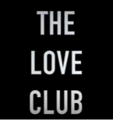
FONT CHOICE FOR DIGIPAK
Final Choice of fonts (Digipak)
After researching and evaluating our inspirations use of fonts such as Lana Del Rey and Lorde herself, as well as some unconventional indie bands such as the Gorrilaz, we came up with the idea to stick with the plain and spaced out font in order to apply genre conventions to the artist and not try to be too alternative as our audience research showed that the demographic liked the simple and clear fonts more than fonts which are more unique as they feel it is 'trendy' and 'cool' to have a simple font and believed it represented the mood of the alternative genre much more than the latter.
SYNERGY PURPOSES AND FRANCHISE

For the purpose of making our artists album theoretically successful, by using the same font in both the digipak and the music video this will elongate the longevity of the albums franchise as it will make the font and the format of the album easily recognizable to audiences and will help the demographics connect the digipak to the music video.
In conclusion...
This font and format is suitable for our music video as it is conventional to our genre as it is simple and has been inspired by the simplicity of the original artists font usage, Lorde. We aren't using the exact font of which Lorde uses but we aren't changing it too significantly and making it too unconventional because we want the audience to still have the same demographics applied to our digipak and music video, and by using this font in both media texts we will be able to prolong the Franchise and create a logo which is recognizable to the audience and easily reflected.

Comments
Post a Comment